What shape are your emotions?
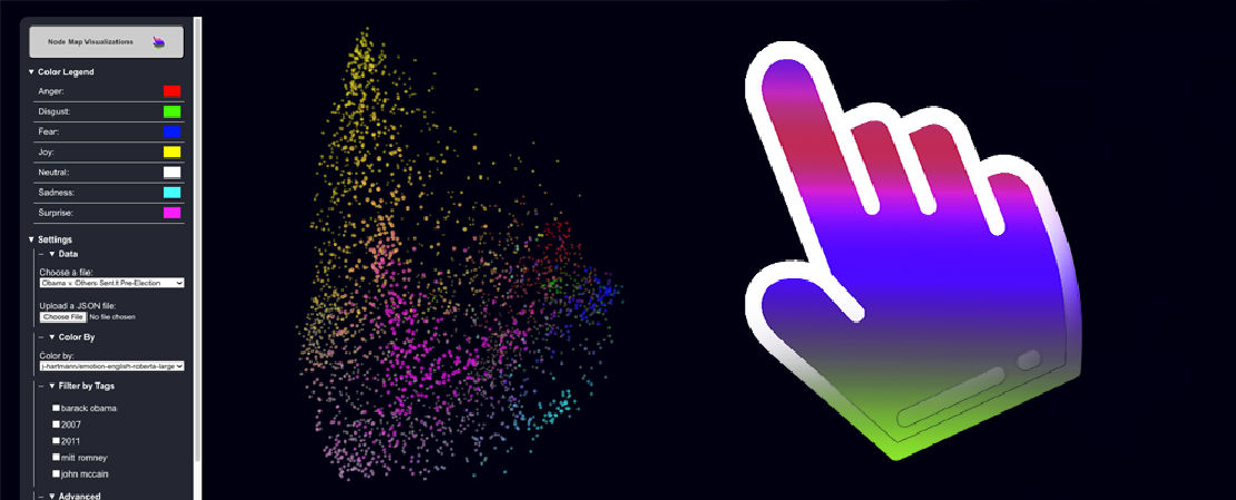
Emotion Profile is a web application I created that visualizes the sentiment around comments on the Flickr website regarding and before the 2008 and 2012 US elections. After a school quarter of manipulating and analyzing dots (from 3 completely unrelated projects), I want to bring to attention my semi-new favorite way to visualize a network of seemingly unrelated data points.
The Shape of Emotion: Testing Pre-Trained Models with the Tool
Recently, I have been encountering a reoccurring need to create visualizations that help me spatially understand the shape and contents of my data post-processing… that is, before I know what insights I intend to uncover from the data. My problem is, I don’t want to make 80 different visualizations from every angle of my data every I want to explore what my data looks like, and I don’t have the patience to read and interpret all the rows of my data one-by-one. However, without fully understanding what my data looks like or how it’s shaped, I have a hard time finding patterns in my data worth analyzing, or how to best fit predictive models to my data.
In a perfect world, I would have a quick tool at my fingertips that helps me understand my data with little to no bootstrapping.
I thought back to an internship I had a while ago, while I was still in the SWE womb trying to comprehend the complexities of basic Git usage. We had access to this amazing tool that allowed us to see how data looks in 3D space, once the DS team vectorized it for our purposes and flattened the dimensions. And most importantly, every time I used this tool, I found new insights and eureka moments that led to more questions that I wanted to answer. I knew at that point that I had to recreate the tool, but fix some of the pain points that constrained the tool to only proprietary purposes.
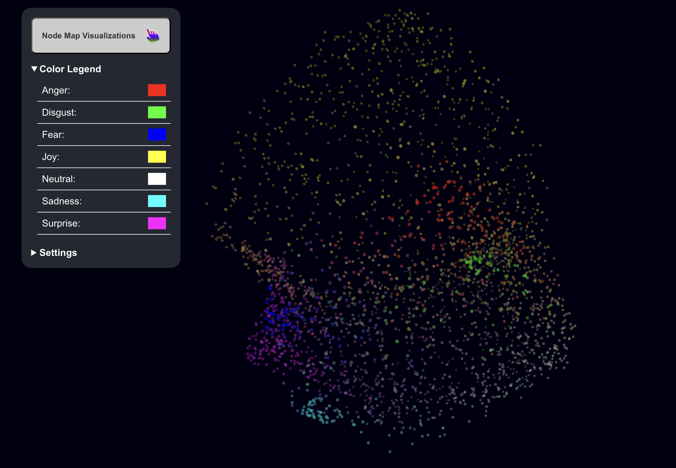
So as I brought this visualization tool to light, I made certain that the tool could be repurposed with ease, so I can apply it to all of my projects related to spatial data analysis. For testing, I decided to try RoBERTa using data from Flickr about Obama in the year(s) before he got elected. Here is a link to access the website: Emotion Profile
Dev + Design Process
Believe it or not, creating a 3D Exploratory Data Analysis Tool was as straightforward as creating one in 2D, so naturally I opted to create a 3D tool.
I found a package for React called React-Force-Graph which allows you to position nodes and create edges as you like within 3D space (which looks awesome). The best part is, it’s fully customizable because on the backend it’s just Three.js, and the amount of detail in the documentation is surreal.
The only caveat - since it is a force graph, forces are applied between the nodes. It’s important to set parameter forceEngine=“none” and charge={0} to remove meddling, specially if there are links between nodes, because forces from links and other nodes will move nodes out of their respective coordinates (but I recommend leaving the charge parameter alone because its effects are miniscule). After turning the forceEngine off, react-force-graph became exactly what I needed to put my nodes in 3D space.
Another drawback was the lack of interactivity, so I dressed up the application by adding features like Settings and the Node Information Popup (when you click a node) to enhance the user’s ability to explore the data on a granular level. Additionally, I wanted node colors to be obvious, particularly since colors are used to better understand the position of the dots, so I added a Color Legend, making it easy to understand what is classified where, and by what intensity.
I also added Light and Dark Mode, because I would never dare forget to give users the option, even though they will just use Dark Mode by default.
This article is a draft. Upcoming changes for this article: more images, more details about emotion data, other use cases of graph, better explanation of how to use it, many corrections (if I have time).


See My Other Posts

Every Website Needs to be Redesigned (Again) for Agent Experience (AX)
Redesigning the internet for User Experience was hard enough - but humans …
Welcome to Woven World!
All children are artists, and their main challenge as life moves forward is …
What shape are your emotions?
Emotion Profile is a web application I created that visualizes the sentiment …